New top story from Time: What Happens When the World’s Most Popular COVID-19 Dashboard Can’t Get Data?
One Monday in late February 2020, Lauren Gardner was working frantically. The website she’d been managing around the clock for the last month—which tracked cases of an emerging respiratory disease called COVID-19, and presented the spread in maps and charts—was, all of a sudden, getting inundated with visitors and kept crashing.
As Gardner, an associate professor of engineering at Johns Hopkins University (JHU), struggled to get the site online again, an official in the Trump Administration falsely claimed on Twitter that JHU had deliberately censored the information.
“Seems like bad timing to stop helping the world with this (previously) useful resource,” read the tweet from Ken Cuccinelli, then the Acting Deputy Secretary of Homeland Security. “Here’s hoping it goes back up soon.”
[time-brightcove not-tgx=”true”]
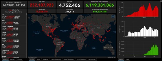
It was a hypocritical allegation coming from an administration official. At the time, President Donald Trump was downplaying the virus’s potential to spread, and government agencies weren’t making public any of their own comprehensive data to support that position. What’s more, federal agencies were looking to JHU to find out what was going on. When former Vice President Mike Pence toured the government’s COVID-19 operations center the same week of the accusatory tweet, a huge projection of Gardner’s website illuminated one wall. The worldwide case count, glowing bright red, stood at 82,548. The total death count was 2,810. (As of September 28, there have been more than 230 million reported cases worldwide and over 4.7 million reported deaths.)
A hotter head, especially one as sleep deprived as Gardner, may have gone off on a social media tirade against the administration. “I’ll just say, it was annoying,” she says now, reflecting on the day. The truth is that she was too busy—and too good natured—to let the comment get under her skin.

Early in the pandemic, JHU’s COVID-19 dashboard filled an enormous void. It was the first website to aggregate and publish case and death figures in near real time: whenever a municipality updated its tally, the numbers would show up on the dashboard. And, critically, the data were easy to interpret and fully accessible to anyone. Even though the statistics were incomplete, they were the most meaningful measurements of the pandemic at the time, and enabled health experts and policymakers to cite the data when writing guidelines impacting how people work, travel and interact. The site helped media outlets, including TIME, report on the latest COVID-19 hotspots and trends. And it meant citizens could understand the risk of spread in their states and counties.
“People were so desperate for information,” recalls Gardner. “We put it out there in a way that was just so easy to interpret.”
It was a trailblazing endeavor. After JHU dashboard’s launch, U.S. agencies like the Centers for Disease Control and Prevention (CDC) and the Department of Health and Human Services (HHS) eventually launched their own robust COVID-19 data websites simple enough for any teenager, grandparent or armchair statistician to dive into. Other countries, along with U.S. states and cities, as well as other organizations and universities followed suit. As these dashboards proliferated, they reset the public’s expectations for what health data should look like. Today, the people trust, and even take for granted, that timely, detailed and nicely packaged information is available at the tap of a screen.
Disappearing data
But it’s a fragile system. Recently, some U.S. coronavirus data have become harder to find or completely unavailable. That’s not because the websites are crashing from traffic overload, but because some U.S. states are consciously removing information or shutting down their dashboards entirely. Gardner and other members of the JHU team are dismayed by the reversal.

“The fact that they created it, the infrastructure sits there, they put resources towards it, and then they decided not to make it sustainable is really concerning and just disheartening,” says Gardner. “It’s like they started going down the right path, and then pulled back.”
By the first week of June, 24 U.S. states were reporting cases and deaths less than seven times a week and four states were reporting only one to three times a week, according to JHU. More states followed suit, even as cases began to rise again due to the Delta variant. Currently, 36 states have pulled back from daily reporting, and seven of them are reporting only three times a week or less, including hard-hit Florida, which is reporting weekly.
https://datawrapper.dwcdn.net/YC8Si/2/
And that’s just for cases and deaths. Other, more detailed metrics are evaporating. Georgia stopped providing data on prisons and long-term care facilities. Nebraska eliminated county-level data, citing a strict privacy statute intended to protect citizens from being identified. (An executive order from the governor had lifted those restrictions during the state of emergency, which ended in June.) Florida dropped its granular reports on pediatric hospitalizations, prompting a state representative and media outlets to sue the health department for them to be reinstated.
Not all of the metrics have disappeared completely. Some are still being reported at the federal level. But the public must weed through nationwide data to find their community—if they know where to look. Want to see death trends among seniors? Dig around the CDC site. Hospital capacity? Best bet is HHS. Cases by nursing home facility? Head over to Centers for Medicare and Medicaid Services.
Plus, federal agencies are often the last stop on the information pipeline, leading to reporting delays and discrepancies. For instance, the CDC cannot officially report a COVID-19 death until the death certificate has been submitted and processed with the agency—a process that can take weeks—which means that the agency’s validated COVID-19 mortality stats don’t align with the states’ stats. The upshot is that the COVID-19 picture is getting fuzzier, even as the highly contagious Delta variant rages across the country, straining health care systems and killing thousands every day.
“We should be doubling down on this infrastructure instead of this how-can-we-quickly-get-the-genie-back-in-the-bottle kind of thinking that we’re seeing in some places,” says Beth Blauer, the associate vice provost for public sector innovation at JHU, who has worked alongside Gardner to refine, analyze and contextualize the dashboard data.
Gardner is similarly frustrated. “If you don’t know what’s going on, then the virus gets out of control and then it’s harder to get back in control.”
Taking on an information void
Aggregating public health data is no picnic. The world, and the U.S., rely on a hodgepodge of (often outdated) surveillance systems. Like a game of telephone, there’s a risk of error and delay each time data are relayed between health providers, labs, and various health departments and agencies. Compounding the problem is the longstanding public-health worker shortage. “The lack of standards and the lack of technology and information systems that are interoperable and can exchange standardized data—that has really been one of the barriers to having timely, complete information in this pandemic,” says Paula Yoon, director for health informatics and surveillance at the CDC.
Gardner, who studies the systems science of infectious diseases—that is, how they spread based on the nature of the pathogen in question, human behavior, demographics and other factors—is not an epidemiologist or a public health official. So like most Americans, she didn’t fully realize the extent of the health system’s problems until she was thrust into a position where she had to grapple with them.
Read More: 73 Experts Offer a Blueprint for Preventing Another Pandemic
On the morning of Jan. 21, 2020, Gardner’s graduate student Ensheng Dong mentioned that he had been tracking the coronavirus in real time. They came up with an idea to plot the roughly 500 cases recorded so far on a map. Dong, a native of China, had lived through SARS, and so was concerned about his family and friends back home. Gardner knew it was a unique opportunity to model, or predict, the spread of a new disease. Because models are only as good as the data fed into them, a real-time, open-source case counter might give them—and other researchers—more insights than the World Health Organization’s once-daily summary reports that often showed lagging data.
By the next morning, the dashboard was live. It featured a map of Asia, with land masses in black, punctuated by bright red dots, some as small as pinholes. China had one in nearly every province—the largest dot was in Hubei, at that point the epicenter of the outbreak. From that day on, the red dots would multiply, jump across oceans and balloon in size until whole continents turned from charcoal black to firetruck red.
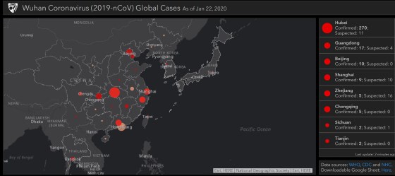
Of course, Gardner wasn’t anticipating any of that, and she didn’t expect the public to be so captivated. “I was like, oh, maybe there will be a few dozen people that are interested in using this,” she says. Instead, the dashboard went viral, growing to one million unique daily visitors by mid-February and 3.5 million in April. From the beginning, there was pressure to keep the map current and accurate.
At first, Dong manually collected and inputted the data from Chinese government sites and dxy.cn, an online community for health care professionals. For other countries, Dong relied on media reports based on statements from local public health authorities, because it would often take days for those numbers to show up in the official state or country tally. He scoured social media for news of cases and even crowdsourced the job—people around the world would email him, flagging fresh numbers from their hometowns.
Gardner managed the thousands of messages and requests from journalists, health professionals and governments. She also oversaw technical aspects of the project, making sure the interactive map and the back-end database functioned properly. Meanwhile, she began assembling a small team of volunteer grad students to work with Dong, who had dropped a class to keep up. Gardner shelved her other research projects. Neither of them got more than a few hours of sleep each day—the global nature of the project meant that the data and inquiries needed attention at all hours.
“I clearly remember having a dream that I put some British overseas territory under the French [count],” says Dong. “I instantly woke up and jumped to my computer and checked if the territory was in the right category. I was so nervous during that period.”
Then, the red dots began to spread across the U.S. JHU went into lockdown with the rest of the country. Gardner was running on adrenaline. The information JHU was providing filled a massive void—no other national health ministry was updating case and death counts as frequently. But the dashboard’s popularity threw Gardner into a position of authority that she hadn’t signed up for. “I wouldn’t have proactively sought out this job,” she says. “I am a data user, not a data provider.”

The team had to smooth out imperfections on the fly. Take, for instance, the single red dot in the middle of the Atlantic that represented cases without geographic data. It lived at 0 degrees both latitude and longitude, a point known as “Null Island” by geocoders because it represents data that is empty, or null. It wrongly gave the impression that there was a growing outbreak some 300 miles south of Ghana. Another time, when virus-positive passengers on a cruise ship were repatriated to the U.S., the team generically assigned them to the “United States.” That put a dot in the middle of the country, prompting residents of a Kansas town to demand JHU offer an explanation and a correction.
Still, fixing the map’s presentation was easy compared with fixing the data collection problems. As the virus spread, manually updating the dashboard became unsustainable: by the time the team had circled the world, the data would be outdated and they’d have to start again.
So Gardner assembled a willing and dedicated geek squad. One group of coders at JHU’s Applied Physics Laboratory offered to write computer programs that could automatically scrape data from sources, organize it into a clean format, and flag any anomalies for a second, manual look. ESRI, the company providing the dashboard’s map software, upgraded the website incrementally over several months, working to stabilize it without having to ever take it down entirely.
“It was the equivalent of trying to change the tires and the engine of a moving car, and then repainting it and then adding a trailer to it,” says Sean Breyer, an ESRI program manager who was integral in the JHU effort. “There was no way to stop.”
Read More: Inside the Group Peddling a Bogus COVID-19 Treatment
Also joining the effort was Lainie Rutkow, a senior advisor in JHU’s president’s office, who corralled experts from around the campus to lend knowledge and insights. One was Blauer, who took on data analytics, built charts and wrote about trends. Another was Jennifer Nuzzo, a senior scholar and associate professor of epidemiology at the Bloomberg School of Public Health, who spearheaded an effort to publish testing numbers and positivity rates.
The cogs behind what became known as the JHU Coronavirus Resource Center began to turn more smoothly, but one systemic problem remained: The data were riddled with disparities and anomalies. Health departments in the U.S. and abroad were stretched beyond capacity and couldn’t stop to establish uniform protocols for what counted as a case or a death. In the U.S., some jurisdictions included positive antibody tests in their case counts. Others did not. Some tallied probable deaths that hadn’t been verified. And many would do data dumps as they changed methodologies or cleared a backlog of health records.
For example, one day in mid-April, 2020, one of JHU’s sources added three digits to Okaloosa County, Florida, boosting its case count a thousandfold overnight. Another: this past spring, the United Kingdom reported negative case numbers, after finding that thousands of people had received a false positive test. And just a month ago, France made several back-dated revisions to its nursing home death count, which hadn’t been updated for six months.
https://datawrapper.dwcdn.net/hFSHz/1/
Still, the team never took liberties: they reported only what the health agencies and other reliable sources published and worked as quickly as possible to deal with irregularities.
A messy and testy data revolution
JHU’s real-time counters have never shown a complete picture of the actual case and death counts. For one thing, official reported cases might not show the true extent of viral spread: many people who have likely contracted COVID-19 have probably not been tested, particularly if they were sick in the early days of the pandemic or if they never exhibited symptoms. Moreover, the emails, faxes and pdf documents sent from labs to the health departments must be manually processed, causing delays, especially when they are incomplete.
Unlike JHU, which reported information as soon as it became available, the CDC waits on the states to send information, which can take weeks or months. Public health experts say there was little chance that the CDC was prepared to monitor the virus from the outset. “Our public health data are way outdated,” says Marcus Plescia, the chief medical officer at the Association for State and Territorial Health Officials. “We need to modernize the infrastructure so that our systems work and communicate well across states and compile national data more quickly. JHU did that when CDC wasn’t able to. JHU had the ability to be facile and nimble and work with what was there in a quick time frame.”
Yoon, the CDC surveillance director, agrees that systems are overdue for an overhaul. “The lack of investment in the public health infrastructure for these past 10, 15, 20 years have left us unable to have the timely and complete data that we—CDC and state and local entities—need to respond more quickly,” she says.
In an effort to catch up, the CDC launched, in April 2020, an online COVID-19 Data Tracker, which eventually expanded into a comprehensive website chock full of charts and the latest research. But getting data onto the site was a long and bumpy process. It took until May 2020 for the agency to start reporting in the same fashion as JHU—scraping case and death data directly from state websites, rather than waiting for the health departments to send them. For county data, the agency relied on the nonprofit USAFacts.org until September of that year, when it was able to scrape its own county-level data.
The delay wasn’t just bad for the CDC’s reputation; the absence of a central government data hub left the impression that JHU was the gold standard. Health agencies that were struggling to process the tsunami of health records felt pressure to conform to JHU’s priorities because the dashboard was so popular, says Jeff Engel, formerly a executive director at the Council of State and Territorial Epidemiologists (CSTE) and a North Carolina state health official, who recently retired.
Take, for example, JHU’s tally of “recovered cases.” “Once Hopkins started reporting it, our states had to come up with the metric and were making things up because this was something that Hopkins made up,” says Engel. But it was a tally so woefully incomplete and ill defined, as to be meaningless. “Our staff were going, we don’t even understand what this number means,” says Engel. “And also, why would you even need it?” Gardner says the numbers were sourced from a few places around the world that were reporting them. She admits that it was a shaky data point, and the team eventually dropped it from the dashboard.
Read More: Why COVID-19 Might Be Here to Stay—And How We’ll Learn to Live With It
But bad data have real-world consequences. For instance, U.S. states restricted travel from other states based on the positivity rate—but positivity rate is a metric derived from testing, and testing volumes and the types of tests being calculated varied from state to state.
The JHU team was well aware of the problem. “We were having calls with state departments of health and governor’s offices where they were like, ‘why do we look so horrible?’” recalls Blauer. “We were just so frustrated with the data landscape and the fact that there were no standards.”
The fight to stay ahead
To establish effective public health policies, surveillance data must be timely and accurate, so trends become apparent as they’re happening—not after the fact. That may seem obvious, but that effort takes a lot of time, resources, coordination—and a bit of intuition and a leap of faith that the data-collection efforts will pay off.
Such efforts do often pay off. Consider that metrics like age and race of those infected or killed didn’t exist early in the pandemic. Once those data became available, it became obvious that certain populations, like elderly and minority communities, were getting disproportionately hit. These essential findings lead some states to deploy health education media campaigns and testing centers in the most vulnerable neighborhoods, but those initiatives came too late for many.
We didn’t learn our lesson from that experience. When vaccines started rolling out, demographic data-collection was spotty at best. As states made a greater effort to report it, it became clear that many communities of color were getting left behind.
https://datawrapper.dwcdn.net/MR0fd/1/
Spurred on by those data, many jurisdictions then launched vaccination outreach programs focusing on those communities. Cities deployed mobile vaccination vehicles to the most underserved neighborhoods, for example, and also collaborated with Black churches and charitable groups to serve those without transportation or internet access.
Nevertheless, there remain areas in which lack of data continues to prolong and even exacerbate the pandemic in the U.S. For example, in the spring, virology and immunology experts warned that slow and spotty data around emerging virus variants would hamstring our ability to stay ahead of the disease as it mutated. Sure enough, as the variant was taking hold of the southern U.S., very few positive test swabs were being genetically sequenced to detect which variants were circulating, leaving a huge blind spot. “We were caught with our pants down because by the time we ramped it up, it was too late,” says Engel.
As more and more places stop reporting vital information, history is bound to repeat itself. Sharon Dolovich, who runs a UCLA-based COVID-19 monitoring project for inmates, feels her efforts are increasingly thwarted by corrections departments that have stopped reporting. Despite evidence that prison populations have been especially susceptible to outbreaks, states claim that tracking COVID-19 is not necessary because the situation is under control. That rationale is “a self-fulfilling prophecy,” says Dolovich. “The story you tell becomes reinforced, and then it provides a justification for not doing anything.”

It’s not all bad news, though. In many respects, the COVID-19 data revolution has spurred major infrastructural leaps that health departments can build upon going forward. For example, some of the slow and leaky information pipelines connecting health care providers and state health agencies have already been upgraded. Nearly 10,000 providers now have an electronic case-reporting system, which automatically alerts agencies to cases of COVID-19 as soon as they are diagnosed, along with other information on the patient’s health record, like age and race. That’s a huge jump from the 187 providers that had such a system at the start of the pandemic. What’s better, the system works for any other reportable conditions like HIV, measles and rabies and can be adapted for future diseases.
The U.S. National Institute of Health, meanwhile, launched a data portal in the summer of 2020 to collect and standardize electronic health records from COVID-19 patients. In a world of many different health record formats, the project has been an enormous undertaking. “We took a card from JHU’s playbook,” says Joni L. Rutter, acting director of the National Center for Advancing Translational Sciences at NIH, which oversees the project. “It’s not sexy work, but data need to have integrity.”
Researchers are using the data to find which patients are most at risk for severe disease, and which treatments work best for each patient based on their health profile. Their findings are publicly available. And though the project is only authorized for COVID-19 research, Rutter sees huge potential beyond the pandemic. “Now that this shows proof of principle, electronic health record research might be here to stay and I think it should be,” she says. “The question is, how can we apply it to build something bigger?”
It’s difficult to reconcile such formidable progress and future potential with the ongoing struggle to track the ongoing health crisis. At JHU, Blauer recently launched the Pandemic Data Initiative, a digital hub sharing the university team’s insights and best practices, as well as its ongoing challenges. She confesses that the site serves as “a place where I air a lot of my frustrations with the data.” In a recent post, she highlighted all the problems and inconsistencies with how states are tracking breakthrough cases. (The CDC stopped tracking breakthrough cases in May.)

Gardner, too, remains committed to fixing the ongoing problems and keeping information open and transparent. “The problem is, if we just keep staying behind [the virus], then you keep giving it chances to bring us back to step one,” she says. “The worst thing to do is to not know what’s going on.”
Comments
Post a Comment